

During the 40 years I’ve spent as a classroom teacher I had my course curricula interrupted many times by weather events, disasters, and tragedy. Needless to say, nothing compares to what my former colleagues are facing during this World Pandemic, COVID-19. I know they are all working in overdrive to put together meaningful lessons that will help their students navigate this crisis. Our current generation of educators are well prepared to cultivate a new virtual classroom. I have the utmost confidence that they will achieve the task at hand.
On the occasion of a course interruption, I often searched for a connection between mathematical topics being taught and the event that was taking place. This is what we call a ‘teachable moment’. COVID-19 is a serious virus, affecting all human-kind across the globe but I can’t help but savor, as a teacher of mathematics, the daily news conferences and articles that bandy about words like exponentially, modeling, flattening the curve, projecting, probability, denominator, etc. Teachers of science must be enamored with their subject matter being discussed on a daily basis as well. If you enrolled in an Algebra or Statistics course back in high school or college, then you may remember creating graphs of lines and curves or calculating probability. Surely you remember that one student who always asked “when are we ever going to use this”. The answer is now or, more aptly, every single day of our lives. Mathematics surrounds us in all that we do. While we may not use every concept covered during those math classes of the past, we did build a foundation of knowledge that allows us to use mathematics in our jobs, personal lives, and to interpret information disseminated through social media, print, TV, and radio. If you didn’t quite comprehend the subject matter in high school or you have simply forgotten it (if you don’t use it you lose it), let’s take part in our “teachable moment”.
One of the first concerns raised by the medical experts, Dr. Birx and Dr. Fauci, was the rate at which the virus was spreading. The data they had collected indicated the number of cases were growing exponentially. While they knew that they did not have a vaccine to prevent the virus or medication to cure the patients who contracted it, they worried that the exponential growth of the virus would overwhelm our country’s healthcare system, leading to a greater number of deaths.
Let’s Review
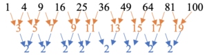
During your Algebra courses, we spent time discussing linear growth, quadratic growth, and exponential growth. If we compare these three types of growth, we may begin to understand why doctors were so worried about the virus continuing to growing exponentially. The tables and graphs on the next page utilize a set of small and workable numbers to help illustrate the differences between these three functions. In each table we determine the number of cases identified (y/output) as a result of the number of days that have passed (x/input).
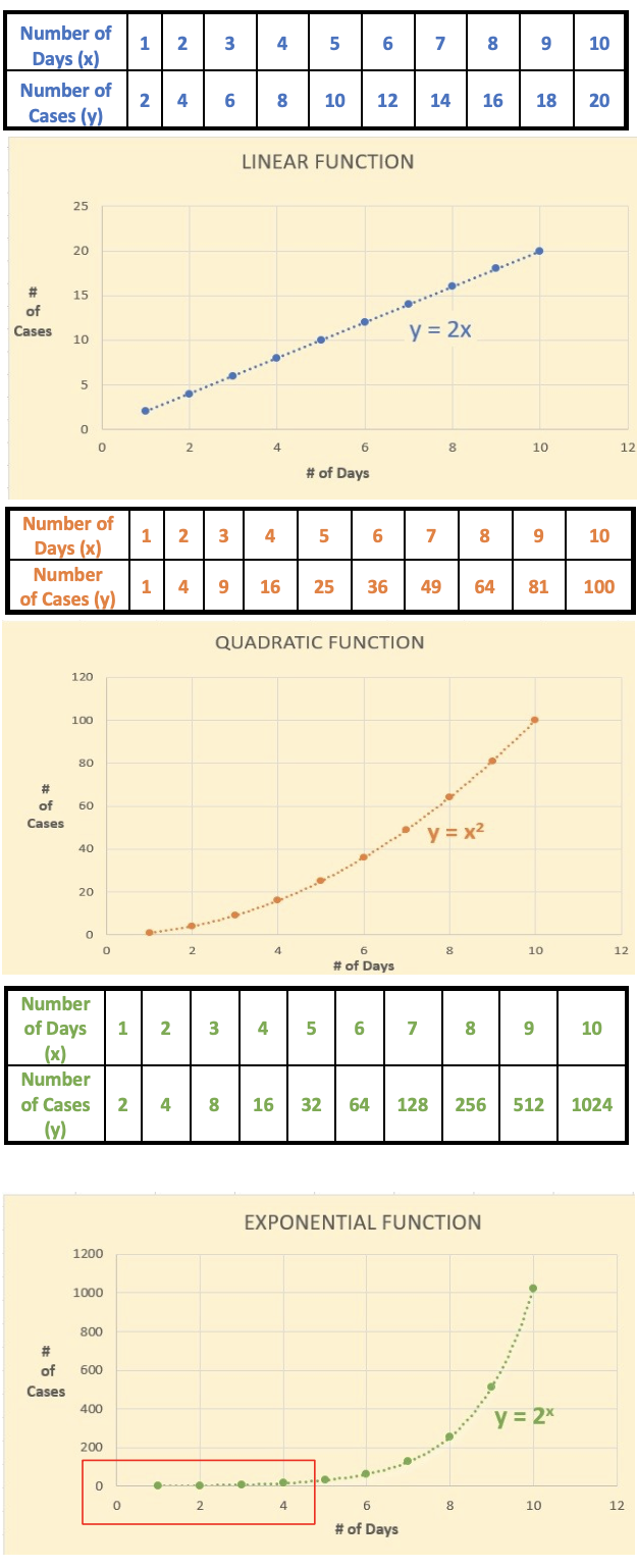
Growth in the form of a linear function has a straight shape with the number of cases increasing by two for every day that goes by. The rate of change is constant. The line can extend infinitely.
Growth in the form of a quadratic function has a curved shape with the number of cases increasing differently for every day that goes by. The rate of change is not constant (sort of). Notice the change of increase between each day (orange). Then notice the change of the change of increase(blue). Yes, it is constant. We call this the average rate of change and it does provide consistency between our points. The curve can extend infinitely.
Growth in the form of an exponential function has a curved shapewith the number of cases increasing differently for every day that goes by. However, if you look at the number of cases, they double, or increase by a constant rate of 100%, as each day goes by. You can rewrite the output as shown below:
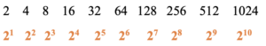
In the exponential graph, it looks as if very little is happening in the beginning. In fact, the curve rises slowly with the number of cases being similar for all three functions, linear, quadratic, and exponential, until day three or four. Then the exponential function begins to rapidly outpace the other two functions. The curve can extend infinitely.
The Model Now that we’ve done a quick review of different mathematical functions, highlighting their shape and characteristics, we should discuss how they relate to the pandemic. When the pandemic began, it was estimated that the number of positive cases of COVID-19 was doubling (increasing at a rate of 100%) approximately every 6.5 days. There are now some states reporting that it takes up to 7 or 8 days before doubling occurs in their region. This is a sign that their curve is slowing down. To keep things simple, we will continue to use our exponential example of doubling every day.
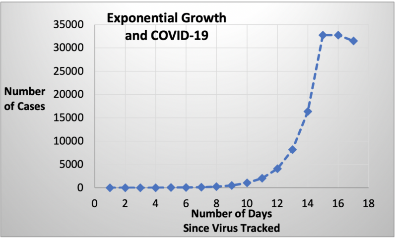
Looking at the chart to the right, you will notice that the curve is rising rapidly, indicating that 30,000 to 35,000 positive cases of the virus have been identified after 15 days. You will also notice that the curve has taken a turn and has begun to flatten out (albeit somewhat exaggerated) or even begin to descend.
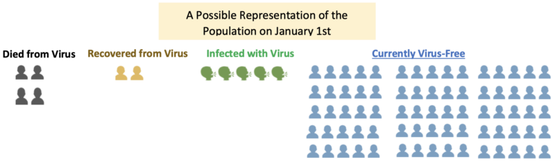
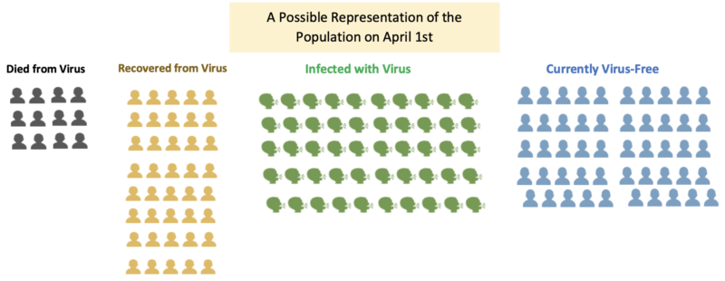
How could this be? We know exponential curves extend infinitely and that there are no approved vaccines or therapeutic medications to treat the virus. The fact of the matter is that the curve shows a model of a population consisting of 4 groups: people who have the virus, those who don’t have the virus, those who had the virus but while recovering developed a certain level of immunity, and those who regrettably died from the virus. The population happens to be a finite number. When the virus began, epidemiologists and statisticians determined (through some rigorous calculations) an approximate probability of COVID-19 being transmitted from an infected person to a non-infected person. This probability, as well as other factors, would become part of the model, helping to predict the number of infections and deaths caused by the infection.
One Problem
One of the most confounding problems in calculating the probabilities mentioned above is trying to determine the proportion of each group identified. Let’s say 100 people were diagnosed positive with the virus and 4 of those people died. The death rate from COVID-19 would be 4/100 or 4%. This would be considered a very high death rate and would most likely cause the epidemiologists to make some bold decisions. However, one of the things you hear the governors and mayors requesting is “more testing”. Administering more tests will certainly identify more positive cases of COVID-19, thereby increasing the denominator in our proportion. When the denominator of the fraction increases, the proportion (percentage) will decrease. Let’s say that we did more testing and found that 400 more people tested positive for the virus but for some reason either didn’t show symptoms or their symptoms were not serious enough to visit a medical professional. Knowing that we probably have a good count on the number of people who have died, our new proportion showing deaths as a result of the virus would be 4/500 or .8%, a significant difference. This difference would likely produce models to lead epidemiologist towards making recommendations that differ from the recommendations made earlier. One thing for certain is that the models will improve if there is “robust” testing.
One More Problem
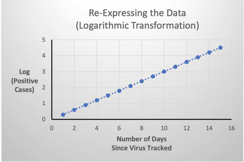 As the incoming data for COVID-19 was being plotted, it took the shape of a curve, an exponential curve. Curves are difficult to analyze with standard statistical tools. To overcome this issue, statisticians re- expressed the data (number of positive cases) by performing a logarithmic transformation. Once plotted, this transformed data would take the shape of a line. This enabled them to calculate a linear function that would yield meaningful information, such as the growth rate of the virus. However, before they could report this information in a meaningful way, they needed to back-transform the results.
Running Its Course
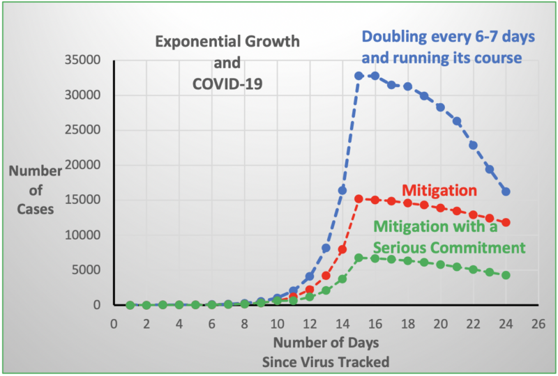 Given all of this knowledge, we can assume that if we let the virus run its course it will eventually fade away. The problem with this strategy is that the rapid spread of the infection will overwhelm the healthcare system. Without available facilities and healthcare workers to treat the sick, many more people will die from the disease than expected. This is why most countries in the world are advocating for some form(s) of mitigation: social distancing, hygiene, shelter in place, etc. The theory is that if we separate the various groups within our population some infections may not occur and others may occur later in the cycle. Either way, we have slowed or “flattened” the curve, thereby relieving the pressure being applied to the healthcare system.
Having shared my mathematical insights, I would like to provide two more thoughts. The first is that all that has been said in this document is an oversimplification of the difficult work that is being conducted by epidemiologists and mathematicians throughout the world. They struggle daily with identifying valid assumptions and carrying out complicated mathematical computations with the help of modern-day technology. Their results are often useful for a short period of time and are never able to satisfy the inpatient and uninformed. Yet they continue to recalculate again and again as time moves on and more data is made available. I wonder if they knew during their high school or college math classes that they would be performing such heroic deeds at this time of their life. Which brings me to my second thought. Situations like this is what teachers live for and students appreciate. They are moments where we can demonstrate the application of the curricula being covered and help bring some order and hope to the chaos that surrounds us. I wish my former colleagues the best in their efforts to continue educating our youth in these uncertain times. Part of me would like to be there with them during this teachable moment.
Stay connected! Be sure to subscribe to Down to a Science— The Official Blog of the Connecticut Science Center and follow us on social media.

Larry Chiucarello taught in Connecticut Public High Schools for forty years. In addition, he taught future teachers of mathematics in Connecticut’s Alternate Route to Certification Program and was one of many professionals who helped develop the BEST Portfolio Program for beginning teachers in Connecticut. Along with his students, he has investigated the complexities of Pi and promoted the holiday intended to shine sunlight on its beauty.